Colour plays a huge role in what I do and so do colour theory.
Besides studying the geometry behind every pattern, I like to add colours to it to create an artwork.
I’m an advocate for “do whatever you like” way of doing art, but I do understand that sometimes you need some understanding of the basic rules.
In this blog post, I’m explaining the very basics of colour theory, using the colour wheel to explain how colours are formed and how they work together.
I recommend creating your own colour wheel, colour charts and swatches for future reference.
1. COLOUR WHEEL
The colour wheel shows you how to mix colours to obtain the colour you want.
Start by dividing a circle (wheel) into 12 equal parts (hello compass and ruler). You can download my tutorial on how to do it here.
Use the primary colours red, blue and yellow, and colour every 4th part. These are three colours that cannot be formed by using or combining any other colour. If these three colours are all combined in equal parts, you will get black. The rest of the colours are derived from a combination of these primary colours.
Then mix the primary colour to obtain the secondary colours. Blue and yellow create green. Blue and red create purple. Red and yellow create orange.
Use these colours to fill the space between the primary colours on the wheel (you should leave one blank space between each colour – you will have blue, blank, green, blank, yellow, blank, orange, blank, red, blank, purple, blank).
By mixing the secondary colours with primary colours, you obtain tertiary colours: Yellow-orange, red-orange, yellow-green, blue-green, blue-purple, red-purple.
Use these colours to fill in the blank spaces on the colour wheel.
If you mix secondary colours together or tertiary colours together, you obtain different shades of maroon.
2. COLOUR HARMONIES
Monochromatic
These are colour schemes made up of shades and tints of a single colour.
Explore each colour in your pallet by adding pigment to make it more saturated or adding water to make it lighter. In this way, you will create an allied combination of similar colours.
Complementary
These are colour pairs that are directly opposite each other on the colour wheel. They represent the most contrasting relationships. The use of two complementary colours will cause visual vibration and excite the eye.
Complementary colours are easy to remember. Choose one colour on the wheel, its complementary is one of the primary colours left or the combination of the two primary colours left. For example if you chose yellow its complementary colour is purple (blue+red). If you chose green (which is yellow+blue) its complementary colour is red.
Analogous
These are combinations of two or more colours that are spaced equally from each other on the colour wheel. These colours have similar light ray wavelengths, so they are soft and easy on the eye.
Triadic
These are combinations of any three colours that are spaced evenly on the colour wheel.
Triads with primaries are strong, but secondary and tertiary triads provide softer contrast. Triads in which two of the colours share a common primary (e.g. purple and orange share red) may seem more pleasing.
3.TONES
There are two types of tones:
-
Warm colours: every colour with red and orange tones is warm.
-
Cool colours: every colour with blue and green tones are cool
Be careful when using different tones together
4. COLOUR SWATCHES
Many artists use mobile apps or google research to find the perfect colour combination for their artwork.
I don’t recommend using this method because when you find a colour that you really like usually you don’t have it in your palette or you don’t know how to create it. I find this method to be stressful and time-consuming.
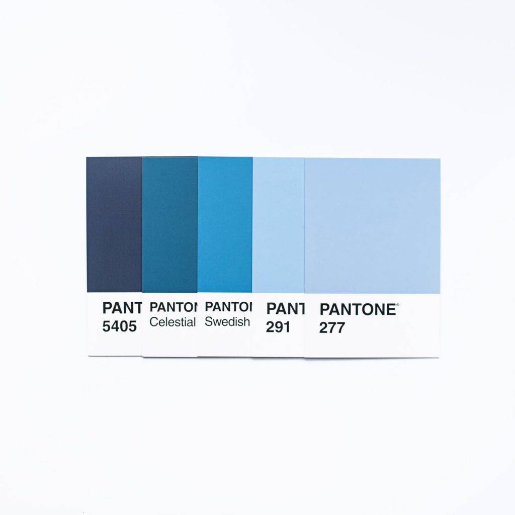
What I do is create my palette swatches. Each colour has been used on a separate card (3×8 cm) and has its name on together with the brand name.
Whenever I need inspiration, or I’m searching for the perfect colour combination, I look at my swatches.
When I buy a new colour, I make a swatch and add it to my palette swatches.
5. COLOUR CHARTS
This sort of thing is perfect to understand how certain colours mix together, colour theory, tones, hues, etc. Let me explain this method, so you can do it yourself!
First, pick out the colour or colours that you want to focus on. For example, yellow and red.
I’ll start with a pencil map. You’ll see a great range in colours and tones if you map out an area of 3 boxes by 5 boxes for each combination. Don’t forget to leave a margin between each combination and between each box.
- At the very top, I have a row of just yellow
- Between each square, I add water to my brush to lighten each time (3 across).
- At the bottom (count down to the fifth box) do the same thing with just red colour.
- From there, you will add a couple dashes of yellow to the pure red mixture on your palette, and move up to the fourth row. Apply three across, getting lighter between each box.
- Add a little more yellow and do the same thing for the third row. More yellow, and repeat for the second row. Now you have your first combination!
Use the margins between the combinations to label which colours you used so you don’t forget!
Try every combination! Even if you don’t think certain colours would mix well together, you may be pleasantly surprised!
If you are more of a visual learner here is a great video that explains how this works
6. COLOUR PSYCHOLOGY
In colour theory, colour meaning and psychology is based primarily on instinct and emotion. How someone feels about a colour or design is entirely up to the individual, and there are no right or wrong answers. However, throughout history, colour schemes have often been used to define different feelings, seasons and ceremonies depending on one’s culture and origin.
Every colour has its positive and negative meaning depending on the way it’s being used.
Here is a short description:
Red
This colour is associated with strong emotions such as love and anger. Use red when you want to get pulses racing and to inspire action. However, use it carefully as red can evoke feelings of aggression and cause visual strain.
Orange
The colour of encouragement in which motivation, excitement and enthusiasm convey. This is the colour of the extrovert, exuding happiness and joy, releasing inhibitions. However, the negative connotations of orange include insincerity, exhibitionism and self-indulgence.
Yellow
The colour of optimism. Yellow is associated with success and confidence. The downside of yellow is that it can induce anxiety and cause one to be over-critical.
Pink
Pink has associations with tenderness and nurturing while conveying a sense of safety and even vulnerability. But pink is also associated with being unrealistic and overly optimistic.
Purple
purple inspires reflection and self-awareness. It is the colour of the sensitive, compassionate introvert soul. Purple has long been associated with royalty, and characteristics of quality and luxury. Overuse of violet can invoke irritability and arrogance.
Blue
blue is the colour of trust. It induces calm, serenity and peace. Cool blue is conservative and can also be perceived as aloof. It also suppresses the appetite.
Green
The colour of growth and health. Green has a strong association as a refreshing and peaceful colour. It evokes the feeling of abundance and a plentiful environment while providing a restful and secure feeling. The prosperity signified by green can be negatively perceived as materialistic and possessive.
Brown
The colour of the earth. Stability and a solid foundation is the message that emanates from the colour brown. This colour relates to things that are natural and simple. On its own, brown seems unsophisticated, but when combined with others can become quite elegant.
Grey
Grey is linked with maturity and protection, being reliable and practical. But grey is also considered to be an unemotional, detached colour seeking to avoid attention. It conveys gloom and depression.
Black
The colour of mystery. Black is formal and sophisticated, strong and powerful. It is the colour of things that are scary and evil. Black conveys pessimism and a lack of hope. While black has many negative associations, it is still refined, elegant and confident. Black is helpful to other colours, being a strong contrast and making them stand out more.
White
The colour white is colour at its most complete and pure, the colour of perfection. The psychological meaning of white is purity, innocence, wholeness and completion. However, it also can give the feeling of sterility and coldness of emotions. Too much white can cause feelings of isolation and emptiness.
I hope you like this blog about colour theory, and I hope you will use it as reference for any future need.
Whenever you are in doubt or need help, this guide will help you decide your colour palette.
Colour Theory: the Ultimate Guide
July 2, 2020


Thank you… This is very useful! ☀️
Thank you! A great primer into further study.
Wonderful explanation of colours and colour theory!
Thank you Sandy
verrrrry useful blog thank you!
Interesting to know so many colour theories. Way to go Sandy
[…] Colour Theory: the Ultimate Guide […]