


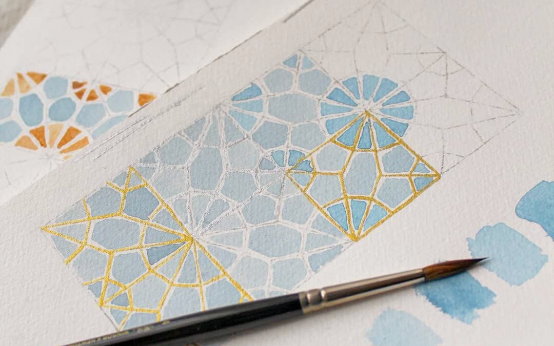
You have spent the last hours (or maybe even days) drawing an Islamic geometric pattern, and now it’s time to finally add colour to it. You open your palette, and suddenly a question pops up in your mind “And now? What is the perfect colour palette for this drawing?”
You thought the hardest part was to have the pattern look symmetrical and geometrically correct, but it turned out your struggle had not finished yet. I’ve been there! It’s just that there are way too many combinations that one can use, and it’s difficult to move from the same one you have used over and over again in old paintings.
At the beginning of my career, I was saving and pinning every inspirational colour combination I could find. But that hasn’t helped me at all.
What happens is that:
a) you might not have those hues in your palette. This is why, before doing anything, you should create swatches of the paints you have available to keep as references when picking colours for your colour palette.
b) not every pattern is the same. The colour palette that looks great on one pattern might not look the same on another one.
That has brought me to create my own routine for colour picking, and here I am sharing it with you.
So here are my top 3 secrets for the perfect colour palette
Start with the main colour
First, start by picking a main colour and building around it. This will serve as the foundation for the entire palette and will help guide your choices for the other colours. Choose a colour that you love and that represents the mood or vibe you want to convey.
I usually start with a bold colour such as deep blue, dark green, and deep red, and I use it in the shapes around the rosettes and single patterns.
This means that I don’t have my perfect colour palette figured out straight from the beginning. Rather I build on the colour choices that I make in each step.
Step back
This part is crucial. Once you’re done with the first colour take a step back and look at your composition.
Which colour do you think would look great to be added now? And where in the design?
I usually put my painting at the end of the room against the wall, I sit on a chair and contemplate it. I close my eyes and use my imagination.
Once I come up with the next colour, I pick it from my swatches, put the swatch next to the painting and step back again to contemplate my choice. You can also use multiple swatches and choose the one that looks better.
You have finally picked the next colour? Well done. Now use it on a small portion of the painting (let’s say two or three shapes only), step back and confirm whether you are satisfied or not with your choice. If yes, then move on to painting. If not, you are still in time to change your mind.
You have two options here:
- if the colour is a light colour, you can easily paint over it with a darker colour.
- if the colour is a dark colour, then you can watch my free video tutorial “how to fix watercolour mistakes”.
Use 2-4 different colours max
I repeat the second step for each new colour that I am adding to the painting, and I stick to a palette of 3-4 colours depending on how complex the pattern is. This is my preference but the more different hues you add, the messier the painting looks. Unless you want your painting to be very very colourful, in that case, you do you.
Bonus tip
Level up your colour game and save yourself time with Procreate or other programs such as Autodesk Sketchbook or Adobe Fresco etc.
Take a picture of your drawing and then use these powerful tools to test your colour palette before doing it by hand.
At some point, you might fall in love with these digital instruments and not want to hand paint again anymore… nah, just kidding.
Choosing the perfect colour palette for your Islamic geometric pattern can be a daunting task, but with the tips above, you can create a stunning and unique work of art. Starting with the main colour and finding complementary hues is the perfect way to create balance and harmony when painting. So go ahead and start experimenting! And if you’re feeling stuck, remember that practice makes perfect. Happy painting!
My top 3 secrets for the perfect colour palette
May 1, 2023


[…] If you want to learn how I choose the palette for my artwork, read my blog post “My top 3 secrets for the perfect colour palette”. […]